Has The Toronto Bubble Finally, Popped?
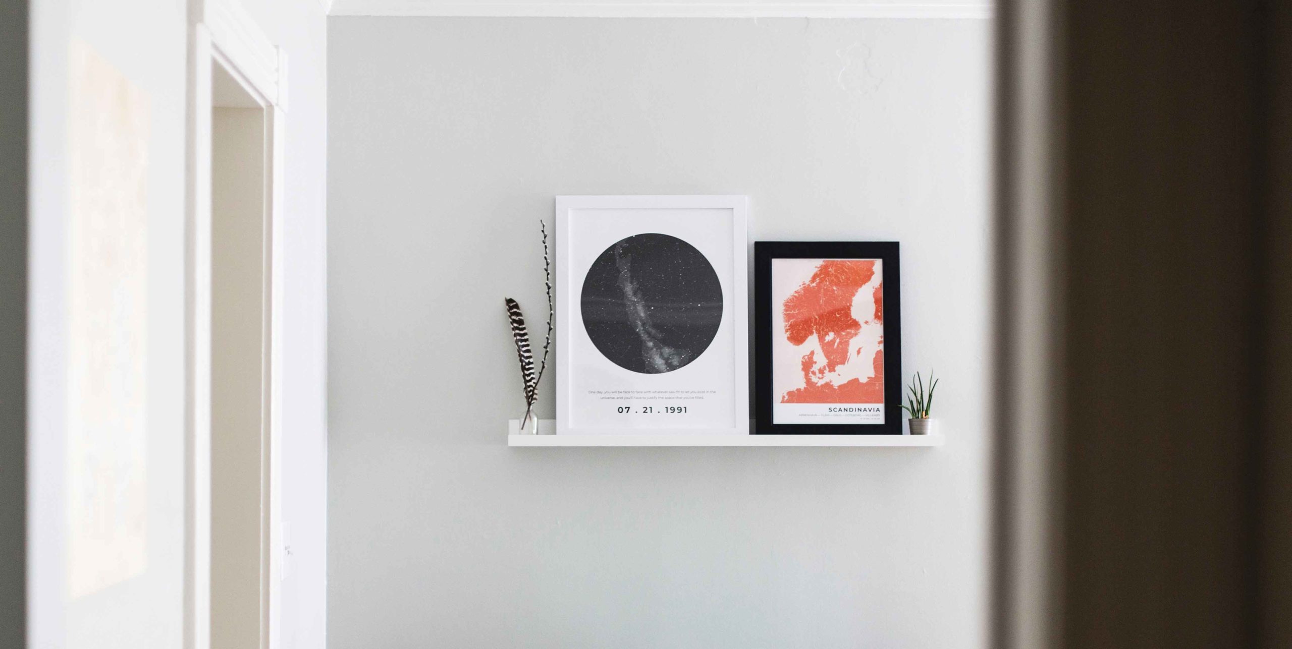
We love art and we love design. And, we want to inspire you to love the art you display in your home! Truth is, how you display art makes a difference – this can take your space from wow to uh, no. But, fear not. Fox Marin is sharing our pro tips to ensure you’ve got that wow factor going for your home.
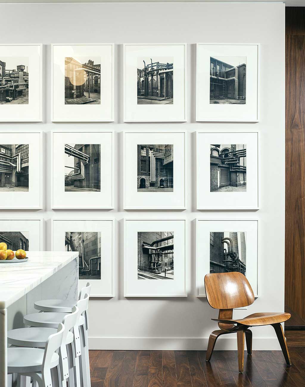
It’s easy, safe and never boring to line up a grouping of similar images. Make sure that your frames are all the same. Get your level out to ensure that each individual image lines up perfectly.
Pro Tip: This is a great way to display black and white photographs.
[Source: Dwell]
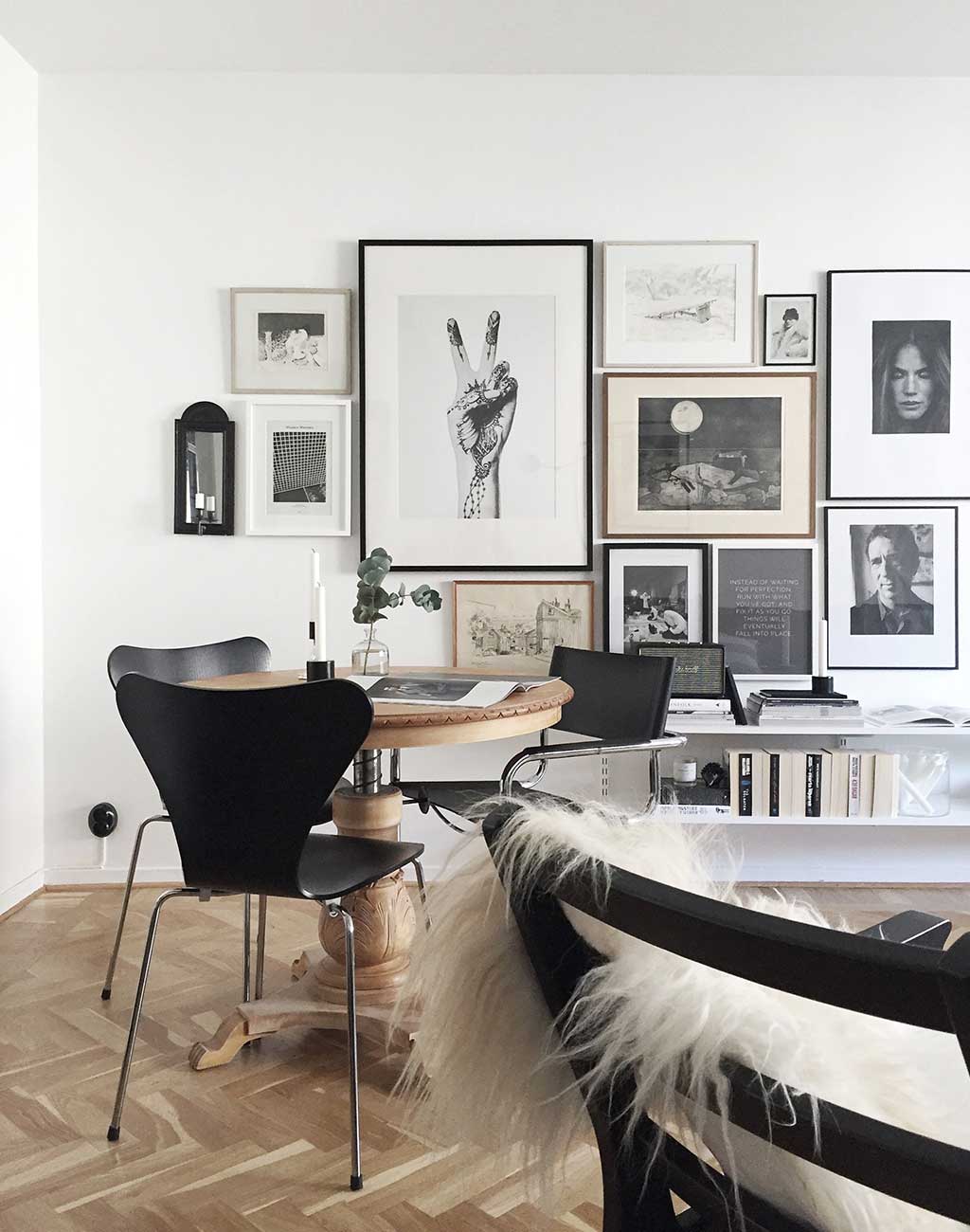
Don’t be afraid to mix and match – images, photos, quotes, frames, sizes, etc. – for a more dynamic gallery wall. As long as every image “speaks to you”, your wall will work.
Pro Tip: Stick to a neutral colour palette or your wall will lack cohesiveness.
[Source: Homespo]
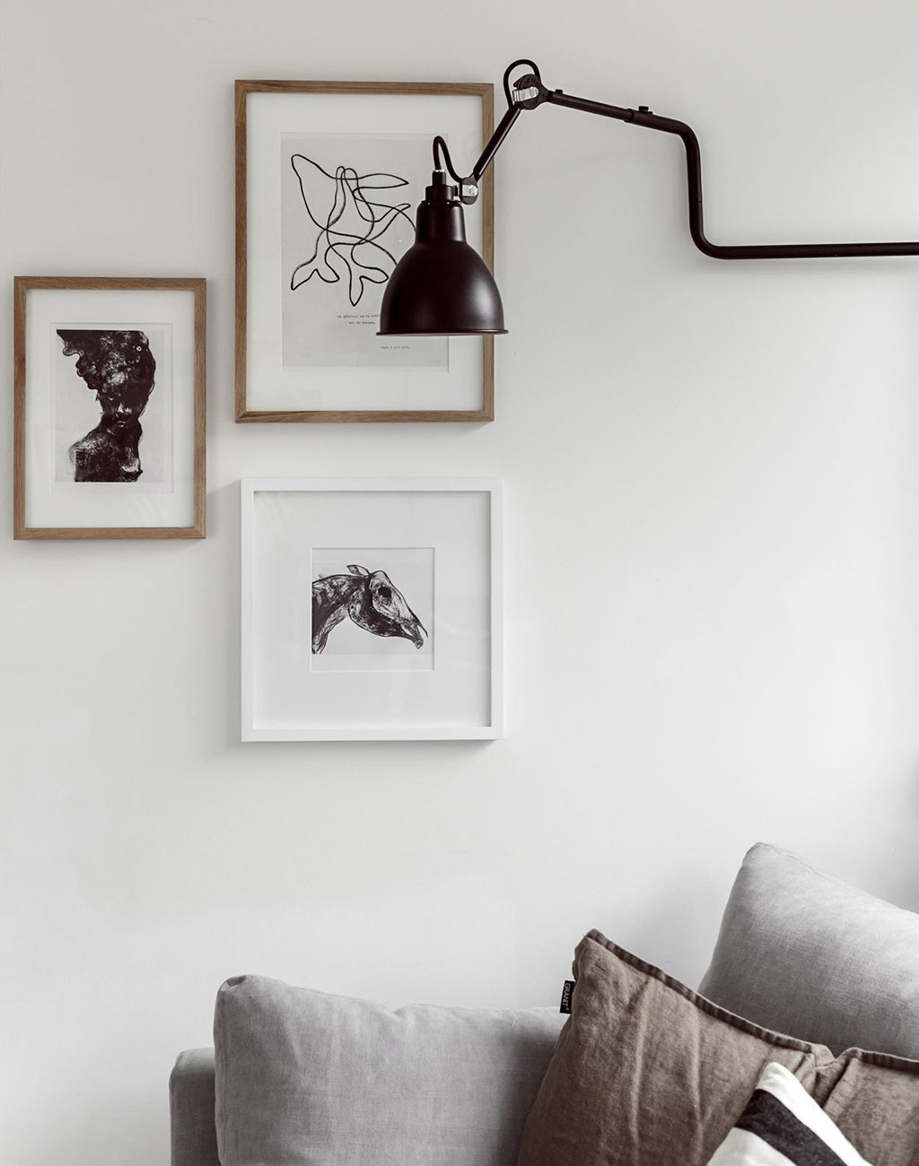
And, less is often more! Pick two or three images that you love and keep your gallery simple, elegant and understated.
[Source: Fantastic Frank]
You have to work hard to go wrong with a gallery wall. You can find hundreds of templates in a quick Pinterest search. Your first step is to find the template that appeals to you. Next, layout your wall and hang your art. And last but not least, sit back and enjoy.
Pro Tip: Sometimes t o o m u c h s p a c e is not a good thing. Art groupings that are too far apart are just, well, unrelated pieces of art on the wall without any story tying them together. We suggest to allow no more than 1 to 2” between smaller pieces and 3 to 4” between larger pieces.
You don’t have to get out your hammer, nails and level to really hit the nail on the head! Leaning your artwork is hip, nonchalant, and effortlessly cool – it’s “imperfectly perfect”. Lean one (or two) large pieces on the floor for insta-wow.
Pro Tip: We always try to lean at least one piece of art every time we stage a property.
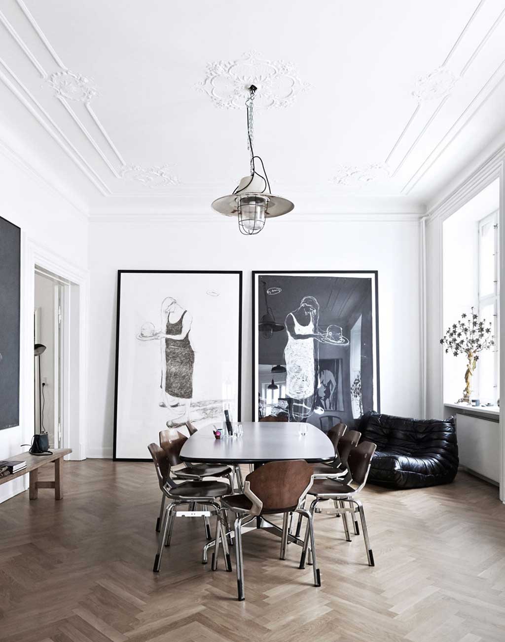
[Source: Coco Lapine Design]
You can display art by layering and leaning on furniture, mantles, ledges, countertops, floors…pretty much, wherever you can. It’s a great gallery wall alternative AND a great option if you don’t want to (or you can’t) put holes in your wall.
Pro Tip: Add an empty frame to your grouping to achieve the ultimate wabi sabi look.
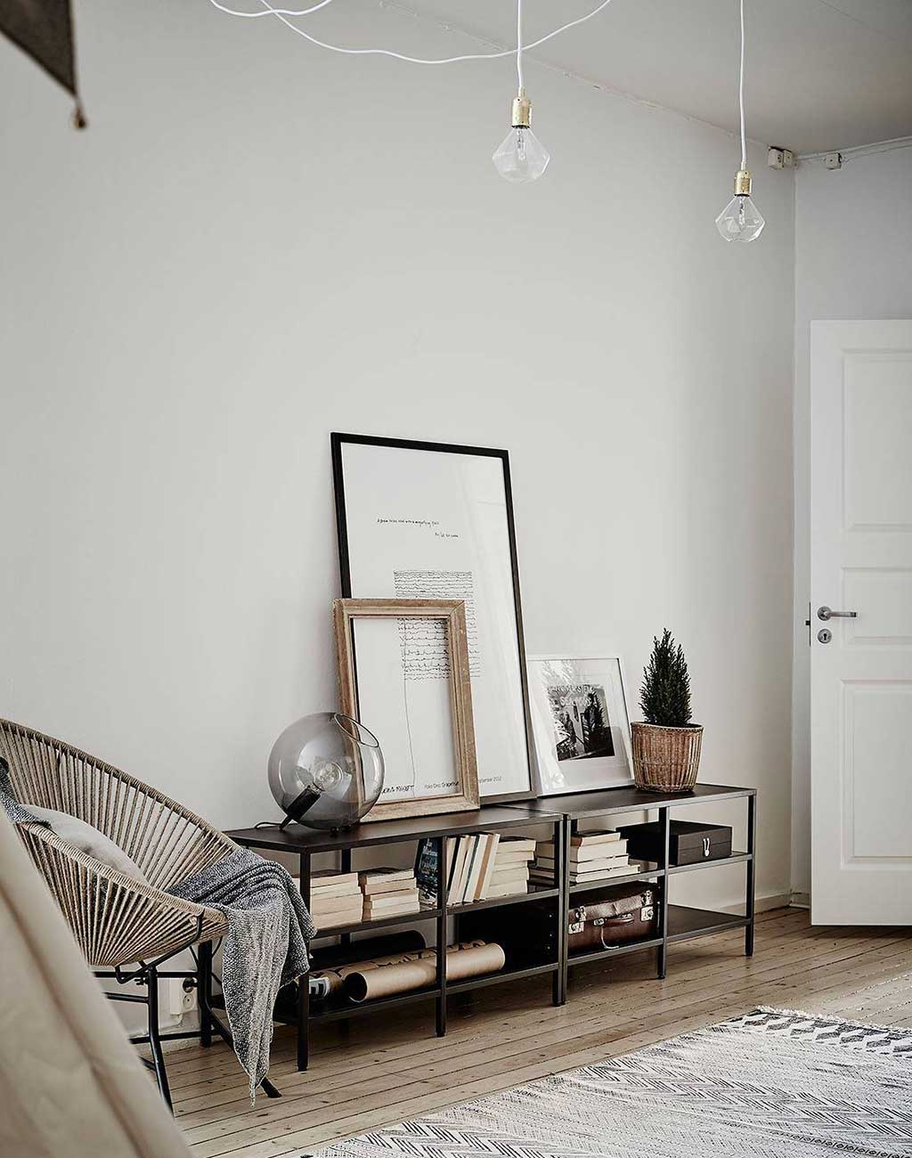
[Source: Coco Lapine Design]
This is the best of both worlds! It’s the perfect marriage of a gallery wall and the more relaxed layering and leaning alternatives. Group your favourite images, quotes, prints and photos on a floating shelf. This looks great over a bed, on a study wall, and pretty much wherever you’d lean or hang your art.
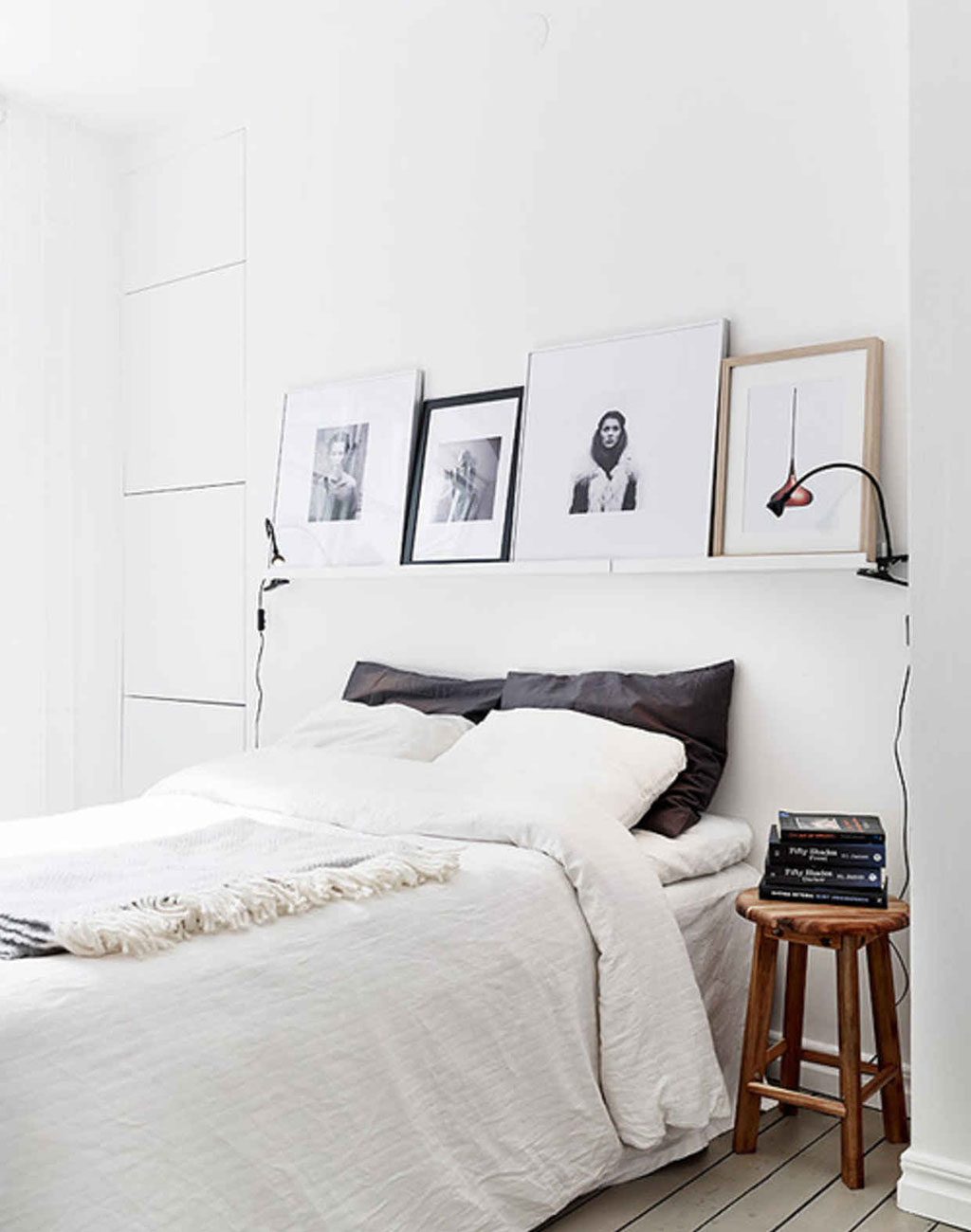
[Source: SF Girl by Bay]
Let’s talk about size. It really does matter. Art that is too small, too big, too high or too low is just that – too small, too big, too high or too low. It will detract from all the effort you’ve put in to collecting your art and making your space your home. This applies to single pieces and groupings – unless, of course, we’re talking about murals which should always go wall to wall.
Pro Tip: It’s so easy to get it right. Two magic numbers. Five. Seven.
Many people hang their art too high. When you display art or group it, this should be hung 57” on centre – this means that the centre of your art or grouping (not the hook) should be 57″ from the floor. That’s the standard in most galleries and museums and we think they know a thing or two about displaying art properly. There are, of course, exceptions – allow for a clearance of 6 to 10” above the back of a sofa or headboard.
To get it just right, art should be between half and three quarters the size of the wall it’s on. It’s easiest just to stick to our magic number – .57. If you’ve got an empty wall that’s 120” wide your art should be .57 the width of 120” or roughly 68” wide (give or take a bit). You could work with a large 40” x 60” print OR create a gallery wall, shelf or layered grouping that’s about 70” wide.
We’d love to see how you’ve displayed your art or hear your thoughts. Please be sure to share in the comments. And, if you’re feeling a little intimidated, FM Design Services offers an a la carte design. We’d love to help you take to the wow factor of your walls to the next level.
—
This article is written by Kathy Mighton, Project Manager and Lead Designer here at Fox Marin Associates. She is FM Design’s creator of well-crafted spaces that inspire and impress! A true design enthusiast, there are not enough walls or surfaces in Kathy’s life to display all the art that she loves.